There is no set way in how to use gradients however I am going to show you the way that I think is best, it will hopefully show you that its not just a slap on effect but can make blending gradients easier and look better.
1. have your image to the ready. It doesn’t matter what stage your image/art is at, you can add gradients at all stages of art work I always find it best not to add gradients at the end (although not always) So when you have your image ready look to the layers pallet and click on the adjustment button at the bottom of your pallet, it looks like a circle that’s half black and half white.
(N.B. if you click the arrow in the circle next to the list of gradients you will get an even bigger list for you to select from)
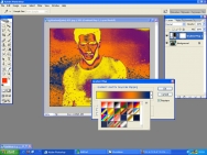
2. Select GRADIENT MAP and a small window will pop up, with a large gradient and with an arrow next to it, if you click on the arrow you will get a lot of other choices of gradients.
3. Once you have chosen your gradient, you will see that even though the gradient is showing on the image you can still see the underlying image, this is in my opinion what makes it blend better. Im not sure why but it does look better.
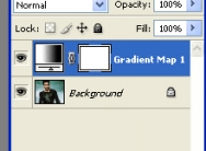
4. here you will notice that a new layer has been created on you layer pallet, it is this layer that you can edit and modify so without ruining the image or the layer you can edit it all you want.
for editing the layer you would have to use the layer mask which is the white square next to the layer preview. If you want to change the gradient all you have to do is double click on the layer preivew.
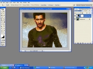
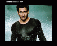
5. usually with gradients I just change the Layer Mode and change the opacity, because I like to have all my colours and tones equal to each other. here is an example of what I did with this image of Jake.
6. The best advice I can give you about gradients is don’t be afraid to use horrible and shocking gradients, as you see with the one I used the horrible Yellow and sickly greens Blue and Purple, actually made a nice tone to the image, I also find with gradients they make the image textured simply by highlighting shadows that were unseen before the gradient map was added.


