Category Archives: Tutorials

Listed below are all the tutorials I have created that you might find helpful, these tutorials are generally quite basic, things that most people don’t think about when creating art, but I’ve found that the small things really make a difference when it comes to making digital art.

The Clearfix

You may be wondering what the hell a clearfix is? Well quite simply its a better way of doing clear:both. Its fool proof and works in all browsers, and if you’re not sure what clear:both does, it basically puts a full stop after any floating div.

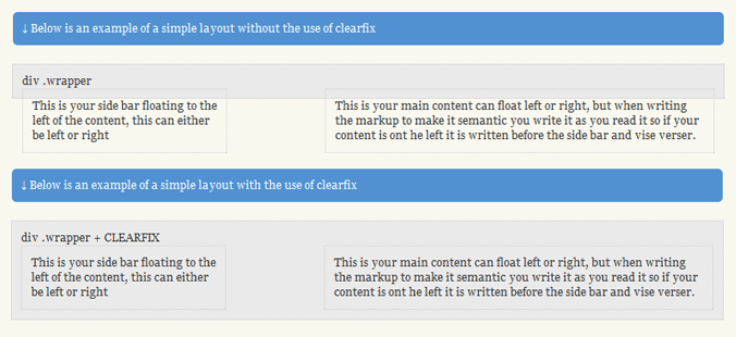
I see it a lot of the times on forums where people are having problems with their layouts or with the new staff at my work its generally the first thing we have to teach them, there are many problems that can occur when you apply floating div’s but 9 times out of 10 the clearfix will fix it! That’s how fool proof it is. If you can remember to use this you will find that coding sites will be much easier.  Below is an example of the most basic error so you can see what I mean.

Clearfix Eample

Live Preview [opens in new window]

So you must be thinking if this clearfix fixes so many problems it must be a pretty hefty piece of code, well no its really simple actually:

.clearfix:after { content:'.'; display:block; height:0; clear:both; visibility:hidden }
.clearfix { display:inline-block }
* html .clearfix { height:1% }
.clearfix { display:block }

That is all it is! Its CSS so its cross browser compatible, which if you’re in the web design industry you will find everything needs to be these days as you can see there are several different rules, these are as the first one .clearfix:after won’t be accepted by all browsers so there are separate rules that if all else fails the other rules will work.

There is even a shorter version but this hasn’t been tested on ie6 but it works all the way down to ie7 so if you’re like me and don’t really care about the people using ie6 as if they can’t update their browser they shouldn’t be on the internet (either because they are at work or they obviously don’t care about the quality of the websites they visit) you can use the code below.

.clearfix:before, .clearfix:after { content: ""; display: table; }
.clearfix:after { clear: both; }
.clearfix { zoom: 1; }

Ok so we know what we need to put into the style sheet but if you don’t put it in your markup correctly it’s just not going to work, so to make sure we know how to put it into the markup we need to understand what it does.

Like I said above what you are basically doing is putting a full stop after all the floating div’s that are causing you problems, to illustrate this I’ve mocked up a problem I’ve seen in the past and generally the most common problem.  Where you can see the wrapper div doesn’t fully extend the two floating div’s. You may think it’s not a problem now, but if you wanted to add a footer or add a background to the wrapper div you’re going to have a problem.

By simply adding the class of clearfix to the surrounding div you can see that the div now extends around the entire layout which is great if you want to create sections to sites you can clearly define the area while not being limited to what you can do within the area.

I have created a wireframe of the homepage of Lucid Fanart to show you how it would look without the clearfix and the simple css has saved me a lot of time, and a lot of screwy hacks trying to make everything fit into the space perfectly. As you can see from the example the dark black lines are the areas where I’ve put the clearfix and you can see a difference in the way everything lines up I haven’t even set positions on things I’ve simply written out the markup and done a few lines of CSS and it simply falls in to place.

Clearfix Lucid Fanart Example

Live Preview [opens in new window]

I hope you found this tutorial useful and that you are able to use the clearfix, if you need any help please post below and I’ll talk you through it, if you have an example please add it in and I’ll try and help specifically to your design.

Ajustment Layers: Levels

I wanted to do a tutorial on colour correction but when I started this I realised there are so many ways you can do colour correction that I might as well work though some of the adjustment layers and allow you to apply them to your work and combine them so this is the first of a set of tutorials devoted the Adjustment Layers.

How to find the Adjustment Layers

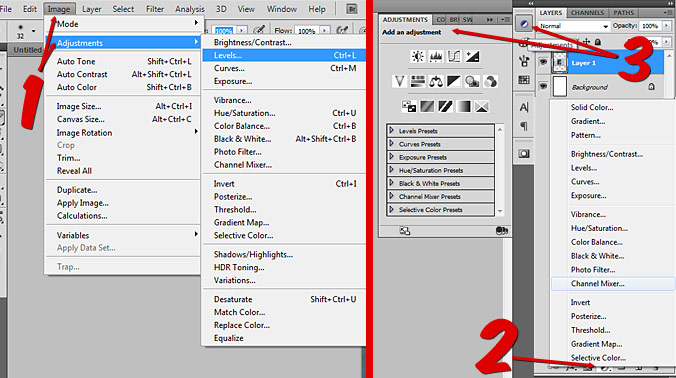
Adjustment Layers

There are several ways you can access the adjustment layers and depending on which version of photoshop you use it will differ and the panels will differ slightly I’m using photoshop cs5

First way you can access adjustment layers is by going to the menu bar at the top of your window and clicking on Image > Adjustments

The next way to access it is at the bottom of your layers palette, the icon of a circle cut into two and coloured black and white is the logo for adjustment layers.

The third way is for the CS4 and CS5 users and only if you have set up your workspace this way you can create quick links and put them anywhere I’ve stuck mine next to my layers palette so its easy access.

Now we know where they are lets start using them.

Ajustment Layers: Levels Palette

For this tutorial a pretty simple one, the Levels palette, with Levels you can modify the highlights, shadows, midtones and you can also target your basic RGB and improve your primary colours within your images. First get your photo, I like to always work with large images simply becuase its easier to reduce images to the size you want than increase them, so you will need to find a great gallery with lots of high quality images such as one of my all time favourite galleries Pretty as a Picture run by Dana of Chosen Art. I’ve chosen an old Buffy season one photo as a lot of the old Buffy images are quite dark and have a lot of mood lighting already applied to it, and with this tutorial I’ll try and show you how to create your own mood lighting.

Adjustment Layers Levels

Okay so first things first lets see what the Levels palette actually looks like and what’s on it.

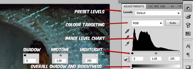
Adjustment Layers Levels Layout

Preset Levels: these are defaults set by Adobe for easy and quick modifications generally these are very slight changes like brining out the highlights or darkening the shadows.

Colour Targeting: this dropdown allows you to target RGB which for the newbies means Red, Green and Blue those are your basic primary colours when it comes to digital images, and before anyone says primary colours are Red, Yellow and Blue, that is for things like paint and colours, RGB primary colours are for anything to do with light and everything digital are displayed on monitors or projects which use light rather than actual colours. To modify all the colours without actually giving priority to a single colour use the RGB option.

Image Level Chart: this is a histogram of the exposure levels on your image on your left side you have the shadows and on the right you have the highlights as you can see the image I chose is quite dark so it has more  pixel density on the left hand side telling us that it is a dark image, and if the image was over exposed there would be more on the right hand side.

Under the chart you have your points which are adjustable and moving them along the histogram to increase or reduce the depth of the selected point.

Shadow/Brightness: I don’t generally use this tool as it simply adjusts the amount of darkness and brightness in the image I much prefer to target specific areas… therefore I don’t know much about this tool so I’m not going to go into it in this tutorial.

Lets begin the tutorial by modifying a colour within the image. There are two main colours in this image, Blue, and Yellow so lets play on those colours and try and give this a eerie blue mood.

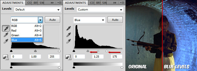
View Original / Blue Adjustment Levels

First select the colour targeting dropdown and select blue this give you a new histogram which represents the amount of blue in your image if we move the highlights and the midtones up the scale a bit we can change the turquoise blue to a much deeper blue and you can also see that her dress has turned a bit more blue even though there wasn’t much blue in there anyway this is becuase we are changing the highlights and there will have been a small bit of blue tone within the yellow.  [click the image to see a full size colour comparison between the original and our amendments.]

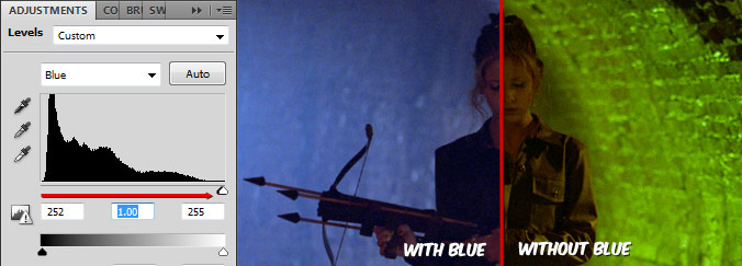
Now we have a blue image, we can also use this method to remove the blue from the image.

View Blue/Green Adjustment Levels

By moving all the points towards the other end of the scale we can almost completely remove any of the blue within the image this is a great way of quickly adjusting an odd unwanted colour in a picture.

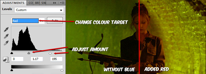
With the levels palette you can combine the different colour targets together to create a new tone to the image. If you now use the colour target dropdown and select Red we can add some red to the image, there wasn’t much red in the image to begin with so this will be a good example of how levels creates colour from the colour that is already present in the image. If you repeat the same sort of action we did to bring out the blue in the image we can convert some of the yellow/green images to an orangey feel [click image below for a full preview of green to orange photo]

View Green/Red Adjustment Levels

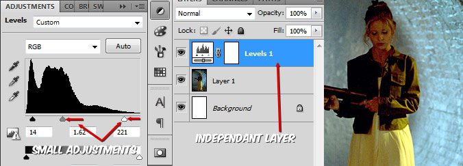
However personally I prefer to use the levels tool to keep most of the colours as they are but bring out their natural colours to make things stand out more such as the brightness of the image, the easiest thing to use it the RGB setting as this will not modify the colours already set in the photo.  So let’s delete that adjustment layer and start afresh. (a good note about adjustment layers are the fact they are independent from the actual photo which means you can adjust the image with out actually affecting the image so if you decided you don’t like something you don’t have to start again this helps when you start using more than one adjustment layer.)

View original/lighting Adjustment Levels

Okay so I’ve lightened the image a bit reducing the amount of shadows by moving the highlights points up the scale and I’ve also soften the shadow, in the general colours by moving the midtones point up the scale. I wanted to keep my shadows black however so I’ve moved the shadow point down the scale a bit

And there we go, your basic adjustment layers palette. View the final outcome of the tutorial or click on the image in this post to view a larger version of the comparisons

PHP Includes

The poll on the footer of my site keeps rising for HTML/CSS tutorials… and although this isn’t a HTML or CSS tutorial it should help a lot of people out who are still only using HTML and CSS. I speak to you all about the heavenly PHP includes. You don’t really need to know anything about PHP to use these they are VERY VERY simple!

Description: “The include() statement includes and evaluates the specified file.” PHP Manual

This basically means putting one file into another; it’s sort of like using iframes but without the horrible scrollbar.

The most common use for PHP includes are layouts. In almost all layouts you have a basic design that doesn’t change when you go between pages (it is always best have consistency within a site it helps the user navigate, and also provides a branding for your website).

So say you have a website with 10 pages in it… well that’s 10 page you need to write the (copy and paste) the layout onto! That’s 10 pages way to much! It’s much easier to write it out once and then within the pages use this PHP script to call the one layout.

All you need to know is this tiny piece of code:

<?php include_once ("includes/FILENAME.php")?>

Not much is it! Lol there are two ways of using the PHP includes

  • Include_once : this basically means no matter how many times the snippet is written out on the page it will only display the content once and any other reference to it will be ignored (this is mainly used for loops as a failsafe but it is good practice to get into and it saves any mistakes in case you accidentally write it again.
  • Include : well it’s the opposite of include_once this allows you to include the file in as many times as you like, I can’t think of a reason anyone would want to, unless you’re calling equations etc and you need to input the same data in more than once but for layouts and minor PHP I would always use include_once

Below is an image that will help you to cut up your page into includes, and remember to never nest any of your tags that is a sure way to break your site.

Document before includes
Side note: it is always a good idea not to include the body tags or HTML tags within the include just in case something happens to the include say someone stops your page from loading properly or PHP on your sever crashes you will not end up with an blank page your unique content will still be visible for users to see and search engines to scan.

Document After includes have been applied

If you need any help with this please comment below and I will try my best to help you out.

HTML/CSS Structure

The people have voted! and 31% of you would like to see some HTML and CSS tutorials, Okay, well to be honest I don’t know where to start teaching you things, I started when I was but 14 years of age, and I learned VERY slowly simply becuase I was learning from the internet which I only had a little bit of access to at the time and in my spare time. I had no idea where to start or what was right or wrong and that long ago there weren’t the big websites that help you out like there are today and there wasn’t any right or wrong way of doing.

I’m not saying I’m an expert but these are a few things I learned along the way.

probably the most basic and helpful tip I can give anyone is STRUCTURE if your code and your files are tidy it is so much easier to write it, rewrite it and learn from it. In my job I have had to rewrite other people’s work or look at other people’s code to decipher if the website needs recoding, and lets face it most of the work we get in from clients their current websites need a total rewrite at the very least so I can read the code properly so I can make the changes the client wants.

Okay so the easiest thing to teach you would be file structure, if you mix all your files up it can be quite difficult to find things and move things about but if you keep things in order then its easy peasy, all the images should be kept together, (and maybe in folders within an image folder if you have LOTS of images) css, scripts and anything else should have its own folder. Below is a diagram of a basic website filing structure which I use every day.

file structureAs you can see I use Dreamweaver, which in the past I have hated with a fiery passion, and I still thing it promotes laziness but if you are in the web design business you will know what time is very precious and you will need a programmes that will help you out, and I think Dreamweaver is one of the best in the market. Anyhow this is the file structure I use in all my websites, the ‘includes’ folder is used when using PHP which I will write a tutorial about later on but basically it contains small snippets of code that needs to be included on every page. (this is also very useful and I will write a tutorial on it later).

The ‘assets’ folder is where you keep all your CSS, images and javascript, I would also create a folder for pdfs, or word documents, or any other kind of file you upload to your server. I used to just shove everything in the main folder and it took ages to find what I wanted.

HTML Structure.

What with the HTML 5 coming into play, structuring websites could get a lot easier and a lot more straight forward but thanks to the evil of Internet Explorer that has infected the internet with its F*** You’s to anything that you try to write that is semantic or anything that validates, and all those people who are forced to use Internet Explorer or people who are too lazy, or don’t know enough to update their browsers anything better, HTML 5 will have to wait around for a bit or you as a website designer will have to learn all the tricks to back date all your websites.

below is my basic HTML structure which I would recommend if you want to make it easy to update. (please note there may be easier ways out there to layout your work but this is what I have found to work best for me)

<!DOCTYPE html PUBLIC "-//W3C//DTD XHTML 1.0 Transitional//EN"
"http://www.w3.org/TR/xhtml1/DTD/xhtml1-transitional.dtd">
<html xmlns="http://www.w3.org/1999/xhtml" dir="ltr" lang="en-US">
<head>
<meta http-equiv="Content-Type" content="text/html; charset=UTF-8" />
<title>SITE NAME</title>
<meta name="description" content="" />
<meta name="keywords" content="" />
<meta name="author" content="YOUR NAME AND WEBSITE ADDRESS" />
<meta name="language" content="en-gb"/>
<meta name="robots" content="index,follow"/>

<!--STYLE SHEETS-->
<link rel="stylesheet" type="text/css" media="all" charset="utf-8" href="assets/css/main.css" />

<!--JAVASCRIPT-->
<script type="text/javascript" src="assets/js/jquery-1.4.2.min.js"></script>

</head>
<body>

<div id="wrapper">
   <div id="header"></div >
   <div id="content"></div>
   <div id="footer"></div>
</div>

</body>
</html>

Head:

This is the basic format I use, and I’m just going to break it down for you now.

DOCTYPE: This little piece of code that tells the browser what version of code has been written in. There are several types of these Doctype

  • HTML Strict : contains all HTML elements but doesn’t include deprecated elements like font.
  • HTML Traditional : contains all HTML elements including deprecated tags.
  • HTML Frameset : the two above don’t include frame sets so if you want to use them use the frame set version. (I wouldn’t recommend framesets they are old and horrible 😉 )
  • XHTML Strict : this is the most strict version it doesn’t allow for any deprecated tags, or framesets and the mark up must be written as well-formed XML.
  • XHTML Traditional : this is what I use, becuase it allows for a few errors, and I am not saying I make a lot of errors but simply becuase if you want your site to work for ie6 and old browsers sometimes you have to use deprecated tags and little hacks to get the site working across the board. but the mark up must be written in well-formed XML.
  • XHTML Frameset: I think you are getting the flow of things right?

for more information about DOCTYPES visit W3School

I would hope you all not what the <html> tag does, there is a little extra code in there that basically sends information to the browser to say what type of html has been written and in what language etc.

META TAGS: The next block of information is the meta tags. These are hidden bits of information that tells the browser things about your website, in the past these have been the main source of information that search engines have used to determine what your site is about, however lately search engines are must more advanced and they are able to read all the content of your site and determine what your site is about from what your write about, so meta tags are no longer the be all and end all of SEO (Search Engine Optimisation)  you now have to write the content of your site very carefully, and search engines also determine the value of your site by the type of code you write. ( I know very little about SEO, it is very in-depth and long winded and if you ask me very boring. you can find out a lot more about SEO here at SEO Moz one of the best SEO blogs on the net)

  • <title></title> this is pretty self explanatory put the title of your site here … duh lol.
  • “description” : here you should put a detailed description of what is on the page, if you have 10 page you need 10 different descriptions becuase different things are written on different pages.
  • “keywords” : these are the keywords that describe your site, these can be the same on every page to make it easier or if you want to be complex you can create new ones but keywords are hard to choose especially if you think about it, there may 1000’s of sites with the same keywords as you
  • “author” : this is basically to say you wrote it, its a good thing to put your name and website address, this is if you are writing it for someone else so if anyone wants to know who coded it they can find you.
  • “language” : pretty self explanatory
  • “robots” : this defines rules for robots (web crawlers for search engines)

There are more than this but you only really need to use title, description, keywords. the others are just filler.

JavaScript and CSS: after the meta tags I always put the assets, CSS first and then the JavaScript if need be, many people like to put the JavaScript at the bottom of the site as it can take a while to load and most people want their site to load before waiting for the JavaScript, but many sites these days rely heavily on JavaScript as it is a common language and most people have browsers that enable JavaScript.

As all the code above is written within the head tag it is hidden from the viewer now we get onto the actual content the body of the the HTML file.

Body:

I like to keep this a simple as can be, I always cut my sites into three second HEADER, CONTENT and FOOTER, almost all sites run on this structure, even if the author doesn’t realise it, you may notice that I haven’t put menu in there, well I put that anywhere I want, as long as it fits into one of these three sections. (cutting your site up this way helps when it comes to using PHP includes tutorial soon)

Wrapper: this is probably the most important thing in the site, the wrapper keeps everything within a certain space. even if your site is a liquid layout (a layout that changes width with the size of the browser window) I tend to do all my sites as a fixed width as it make it easier to code and to be sure what it looks like across different resolutions. but adding a wrapper around things means you can control the shape of everything inside the wrapper.

Header: this has everything that appears on every page at the top of the site your website title, main image, and possibly a menu. you can put as many <div> or content in the header as you want, but the main thing is that everything you want on every page should be contained in the header.

Content: this area should contain all your unique copy, from the title of the page down to the last full stop, these shouldn’t be anything that is going to appear on more than one page (unless you have included a sidebar but if you have included a side bar the best way to do it is to divide your content div into two section, the less confusion between the DIV’s the better. (and I implore you DIV’s not tables!)

TABLES ARE EVIL: just a quick note, I learnt tables first, and I used tables for years!! they are easy to use and make it really easy to divide up your page but they are not supposed to be used for content, or layouts or anything like that, the true use for tables has always been data. I remember when my friend Kitty first told me to use DIV’s I was so against them tables were safe and worked so well but they didn’t they were difficult to move and although they layout the site into blocks which is what I am asking you to do with DIV’s using DIV’s you can move things around the page so much more easily and use the CSS to do so much more with them. Tables are great for any kind of data like a size guide, or a pricing table, or anything like that, but keep it data only please.

Content and Sidebars: as I said above try to keep your content separate from the static content of your site, it will help you when you want to edit your site later on and will cut down the amount of time that it takes to redesign your site when you get bored of your layout and if you are anything like me, I always get bored of my layouts almost as soon as I’ve finished the redesign.

Footer: well all your footer information goes here, most websites have contact details in here, or important information that isn’t very pretty, this could be accreditation, or outbound links, for example my site (at the moment) has a poll, a bit of information about me and all the links to my social networking places, these are important bits of information but they are thing I wanted to show people. I also use this section for a quirky little thing that promotes my commenter, so the more you comment on my site the higher up your name and your website link will appear on the site. However the important thing to remember about the footer is this is for things that appear on every page at the foot of your website.
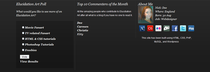
current footer 2010

Okay well I think that’s it, you may think that is a really in-depth way to describe the structure of  web site, and most of you probably already know about everything here, but just hope there was maybe something you didn’t know about or something you are going to try out and if you learnt nothing oh well your doing great and didn’t need to read the post 😉 but like I said there are other ways to do thing this is just what works for me.

Organisation is the key to speed and understanding
Basic Blending in Photoshop

In this tutorial I will talk about blending image together to create a seamless effect for any kind of image and fanart that is easy to use for anyone one from beginners and advanced users alike. This tutorial shows you two methods of blending that work perfectly on their own or used together to create an advanced level of blending.

First Part to BOTH Methods

OK so lets start, firstly pick your images, I like to use large images that way you can minimize them and sharpen then, if you use smaller images you loose quality when you enlarge them. I have chosen two pictures of Brendan Fehr star of Roswell. if you want to use these images to test out this tutorial or you like Brendan Fehr you can get them from these links Image One || Image Two

Create a New canvas any size, I tend to use wallpaper sizes 1024×768 or 1280×1024 it gives you a large area to work with an you can always crop it later. Copy and paste both images into the same canvas and arrange them where you like. (as you know Photoshop uses layers so when you copy and paste the images onto the canvas they’ll be separate layers this is good as you’ll see later.

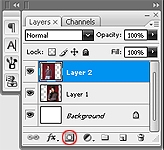
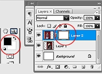
Now look at your Layer pallet that can be found on the right hand side of your workspace, if you look at the bottom of that pallet you will see a square with a white circle, this is the layer mask button. A layer mask basically allows you to control different areas of the present area in this instance it will help us to control the opacity of certain areas of the images.

Once you press the layer mask button you should notice that a white box has appeared next to your selected layer and also your colour pallet (on the left hand side of your workspace) ha changed to black and white. This is because the layer mask relyes on the black and white tones to tell it weather to delete or show the areas. Black = 0% opacity (Delete) white = 100% opacity (Show)

Method One

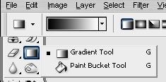
Ok now onto the first method. With this one we are going to use the gradient tool, you have to make sure that the colours don’t change from black and white. Using this method is the easiest way to create a smooth fade, it is best to use this method if want a gradual fade.

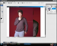
Now that you have your gradient tool selected click and drag your cursor across the area you want to fade. (remember that black means hide. if you suddenly find you’ve deleted the the side you want to keep just reverse the direction you drag your cursor. )

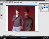
This is how it looks with a gradual fade, this is just the first time you can repeat this several times to get it the right way, but notice how even the fade is on the images, this is useful if you want to blend images rather than manipulate images to make them look like they are the same image.

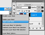
To repeat this action you will need to finalize each action, you can do this by right clicking on the gray box next to the selected layer (in the layer pallet) and select “Apply Layer Mask” then repeat the layer mask and the gradient drag to create a new fade on the image.

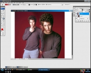
once you repeat the action a few more times you could come up with something a bit like this, however this is just a quick example, if you spend more time over your placement of the gradients you can make it seamless.

Method Two

Ok now onto the next method, in this way we are going to use the paintbrush tool. Select the paintbrush remembering that black means delete and white means show, you can also change the opacity on the paintbrush by looking at the options tool bar found at the top of your workspace, by changing the opacity you can get a gradual fade, you can also use different styles of brushes, as long as you remember black means delete and white means show.

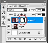
So paint over the area you don’t want to keep, and if you look at the layer pallet again it should look similar to this where the black area shows the area you have just deleted.

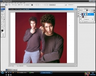
As you can see this provides a more precise way of deleting unwanted areas, I use this method to make images look like they are the same image (photo manipulation) I find it easier to use this one when I know the specific areas I want to get rid of rather than a general blend.

How to Use Gradients

There is no set way in how to use gradients however I am going to show you the way that I think is best, it will hopefully show you that its not just a slap on effect but can make blending gradients easier and look better.


1. have your image to the ready. It doesn’t matter what stage your image/art is at, you can add gradients at all stages of art work I always find it best not to add gradients at the end (although not always) So when you have your image ready look to the layers pallet and click on the adjustment button at the bottom of your pallet, it looks like a circle that’s half black and half white.


(N.B. if you click the arrow in the circle next to the list of gradients you will get an even bigger list for you to select from)
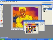
2. Select GRADIENT MAP and a small window will pop up, with a large gradient and with an arrow next to it, if you click on the arrow you will get a lot of other choices of gradients.


3. Once you have chosen your gradient, you will see that even though the gradient is showing on the image you can still see the underlying image, this is in my opinion what makes it blend better. Im not sure why but it does look better.


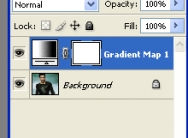
4. here you will notice that a new layer has been created on you layer pallet, it is this layer that you can edit and modify so without ruining the image or the layer you can edit it all you want.
for editing the layer you would have to use the layer mask which is the white square next to the layer preview. If you want to change the gradient all you have to do is double click on the layer preivew.


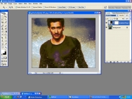
5. usually with gradients I just change the Layer Mode and change the opacity, because I like to have all my colours and tones equal to each other. here is an example of what I did with this image of Jake.


6. The best advice I can give you about gradients is don’t be afraid to use horrible and shocking gradients, as you see with the one I used the horrible Yellow and sickly greens Blue and Purple, actually made a nice tone to the image, I also find with gradients they make the image textured simply by highlighting shadows that were unseen before the gradient map was added.